U.S. Department of Veterans Affairs: VA mobile app navigation redesign
Improving wayfinding in the VA Mobile App to better serve Veterans
The VA Health & Benefits mobile app serves over 2 million Veterans, including those with disabilities. As the app expanded, its initial information architecture (IA) became inadequate, causing navigation challenges. This case study outlines the redesign of the app’s IA and navigation to ensure scalability, ease of use, and accessibility for all users.
PROBLEM:
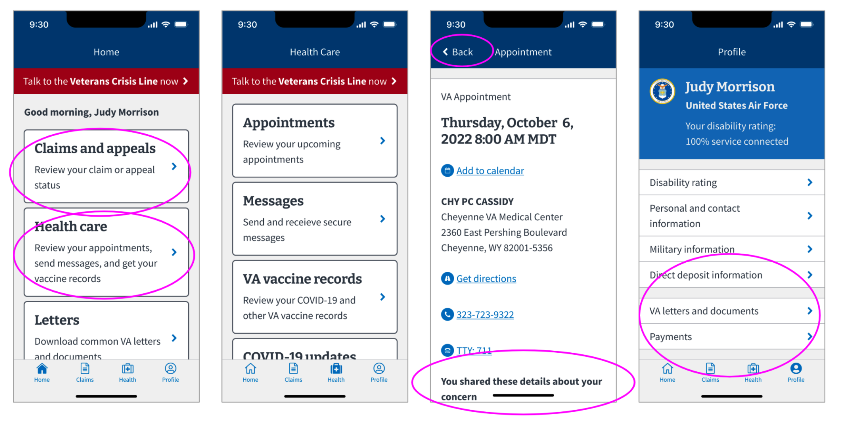
The app’s IA, initially simple and functional at its initial release in 2021, had become cluttered as new features were added. By 2022, inconsistent interaction patterns, unhelpful back button labels, and an unpredictable structure was affecting usability, making it difficult for Veterans to navigate. The VA needed a scalable IA to accommodate future updates without compromising ease of use.
![]()
Inconsistent interaction patterns and IA issues in the VA mobile app, 2022.
Our goal with this work was to create a navigation model and information architecture that matched Veteran mental models and that would grow with the app.
Key objectives included:
Inconsistent interaction patterns and IA issues in the VA mobile app, 2022.
Our goal with this work was to create a navigation model and information architecture that matched Veteran mental models and that would grow with the app.
Key objectives included:
- Scalability without needing frequent IA updates
- Easier navigation for users to find content
- Space for personalized features in the future
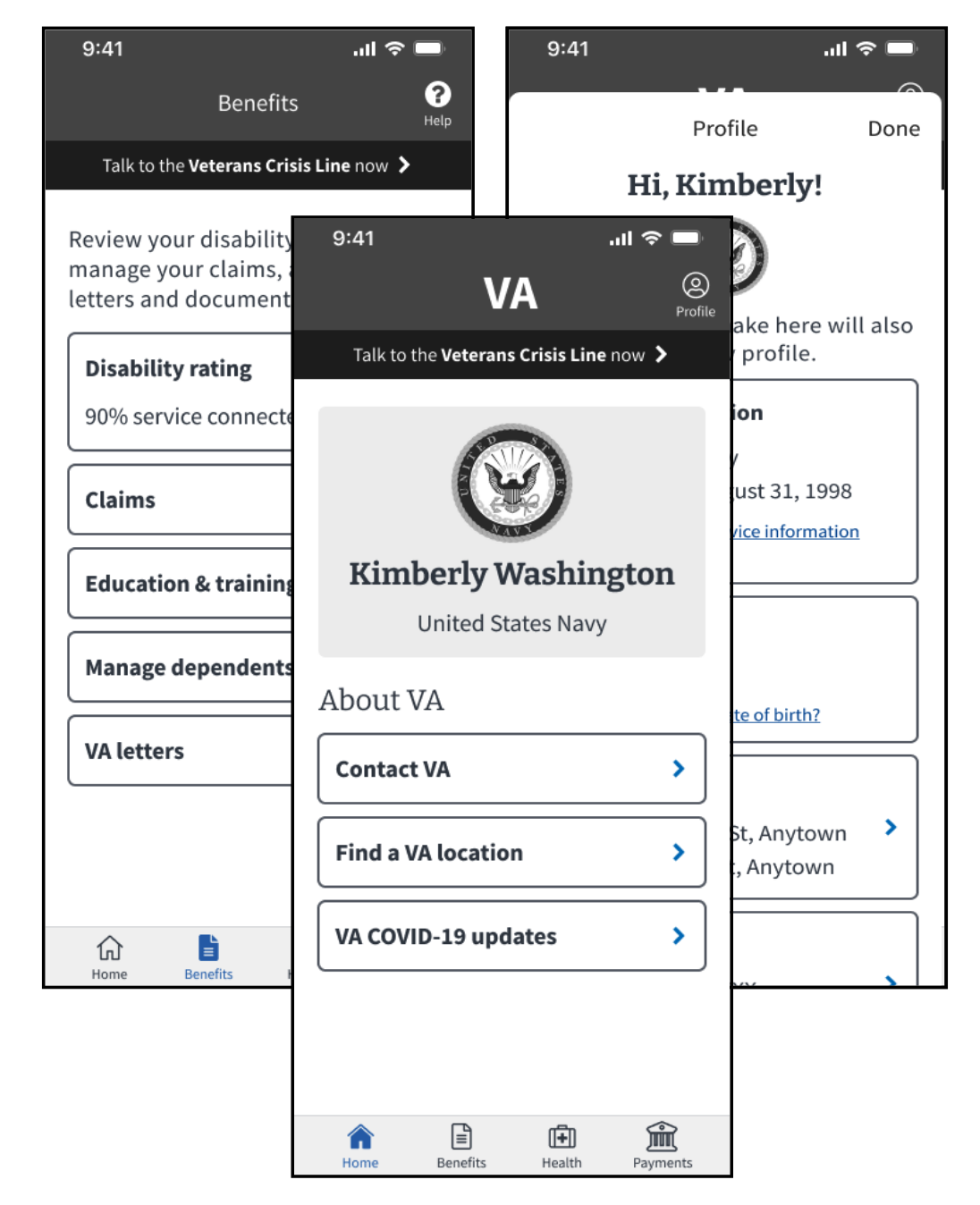
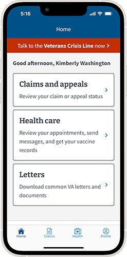 VA mobile app, 2022
MY ROLE:
Information Architecture, Interaction Design, User ResearchI led the redesign of the VA mobile app’s IA and navigation.
My primary responsibilities included:
- Research: Conducting multiple rounds of card sorting and conducting usability testing.
- Design: Redesigning the app’s site map, collaborating with the design team to explore concepts and then designing the final navigation model.
- Implementation: Creating & coordinating the execution of a plan for the delivery of the new navigation across the app in an efficient way. Documenting and evangelizing the navigation changes with the larger mobile team.
- Stakeholder management: Collaborated closely with VA stakeholders to ensure that the wayfinding words we used worked well with language present in the broader VA.gov ecosystem.
IMPACT:
The redesigned navigation and IA resulted in an intuitive, scalable system that improved accessibility and ease of use.- Improved Task Completion: Evaluative research conducted prior to launch showed a 97% success rate in task completion.
- Consistent Engagement: Post-launch analytics showed that engagement with features held steady.
- High App Ratings: In the 6 months after launch, App and Play store ratings remained high, averaging 4.7/5 stars. In written app store reviews during this same period, Veterans consistently referred to the app’s navigation as easy and intuitive.
- Accessibility: Follow-up research focused on blind and low-vision Veterans confirmed that the new navigation design works well with assistive technology, ensuring that the app is inclusive for all users.
How might we help to ensure that the VA Health & Benefits mobile app can scale with future features while maintaining simplicity, intuitiveness, and accessibility for all users?
PROCESS:
The IA design & research process for the work unfolded in four phases:
- Information Architecture: Card sort research & sitemap design
- Navigation Model: Discovery & design exploration
- Evaluative research: Navigation model concept test
- Implementation: High fidelity design and development

Information Architecture: Card sort research & sitemap design
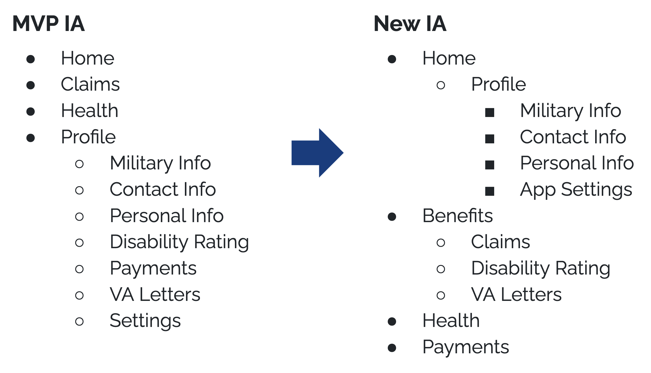
We began by understanding how Veterans mentally organize information in the app through two rounds of card-sorting exercises. These insights informed the creation of an updated, scalable IA that would support future features without requiring constant redesign.As a result of the IA research work, the VA Mobile app’s high-level IA changed:


Navigation Model: Discovery & design exploration
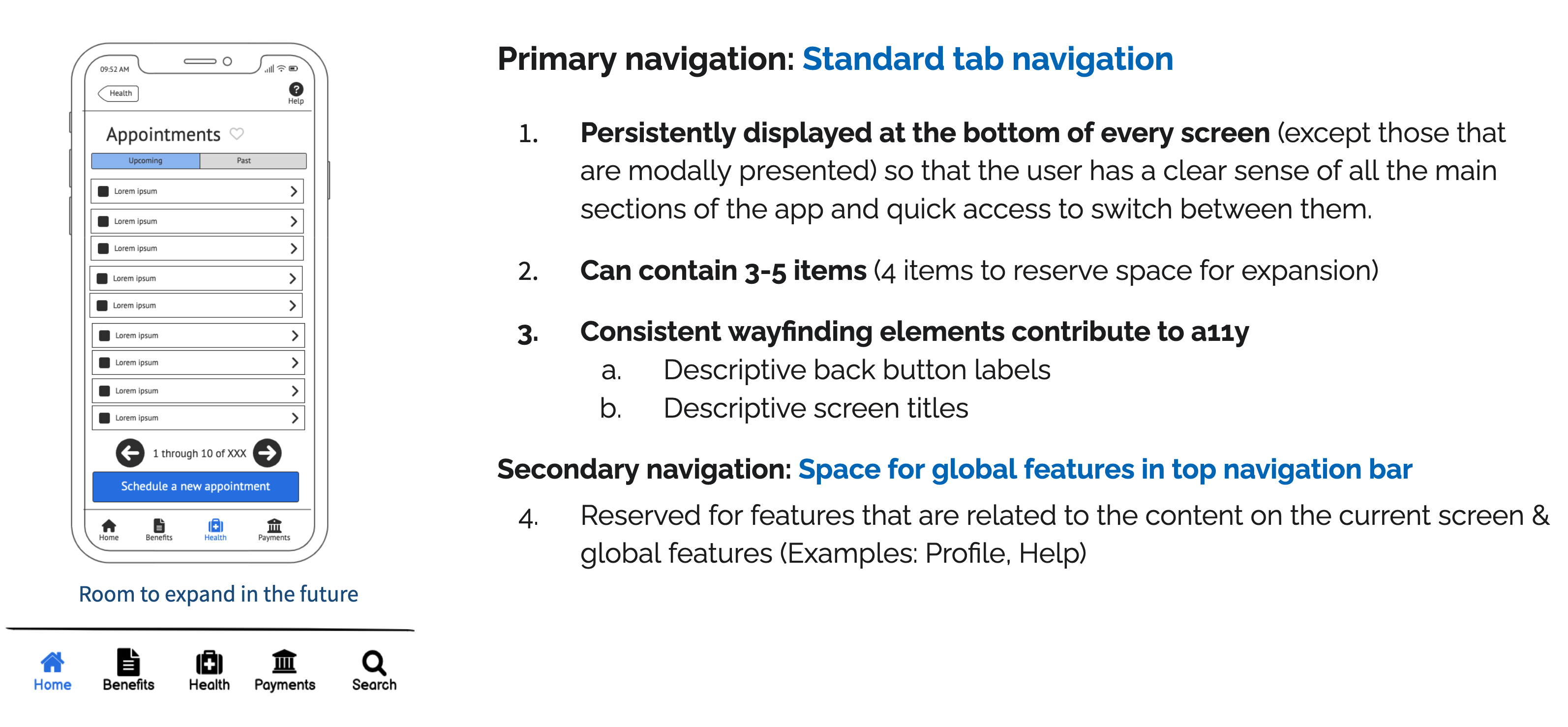
To prepare to design a new navigation model to support the updated IA, we conducted a Discovery sprint to get the team familiar with mobile navigation best practices. As a team, we got familiar with the latest mobile navigation patterns from Apple’s HIG and Material Design. We also conducted a comparative analysis of apps with similar data needs from industries like healthcare and banking to identify common patterns.Next, I facilitated a design studio exercise where the UX team explored various navigation models using wireframes. We audited designs against best practices and success criteria, ultimately choosing a tab-based navigation system that would be consistent across iOS and Android.
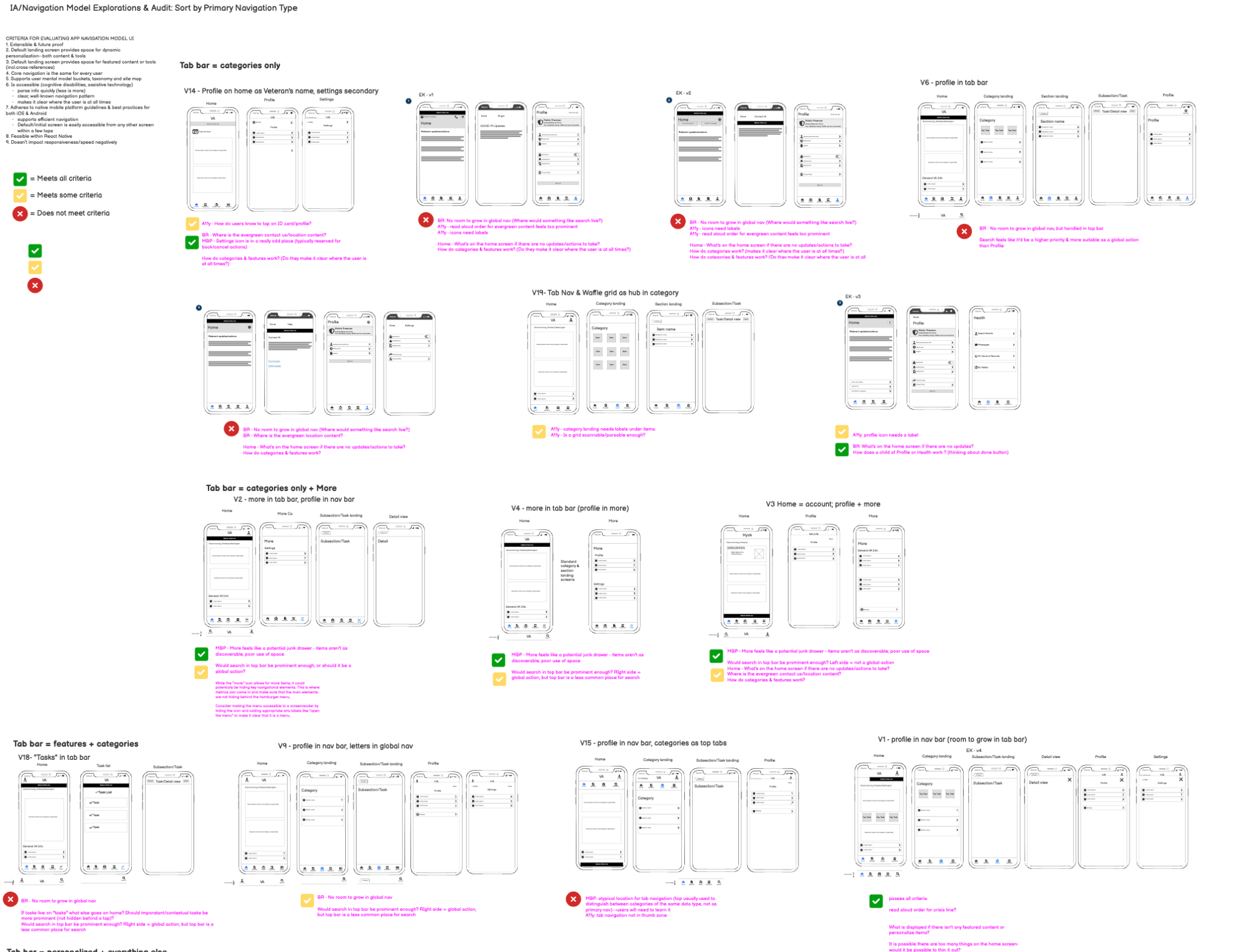
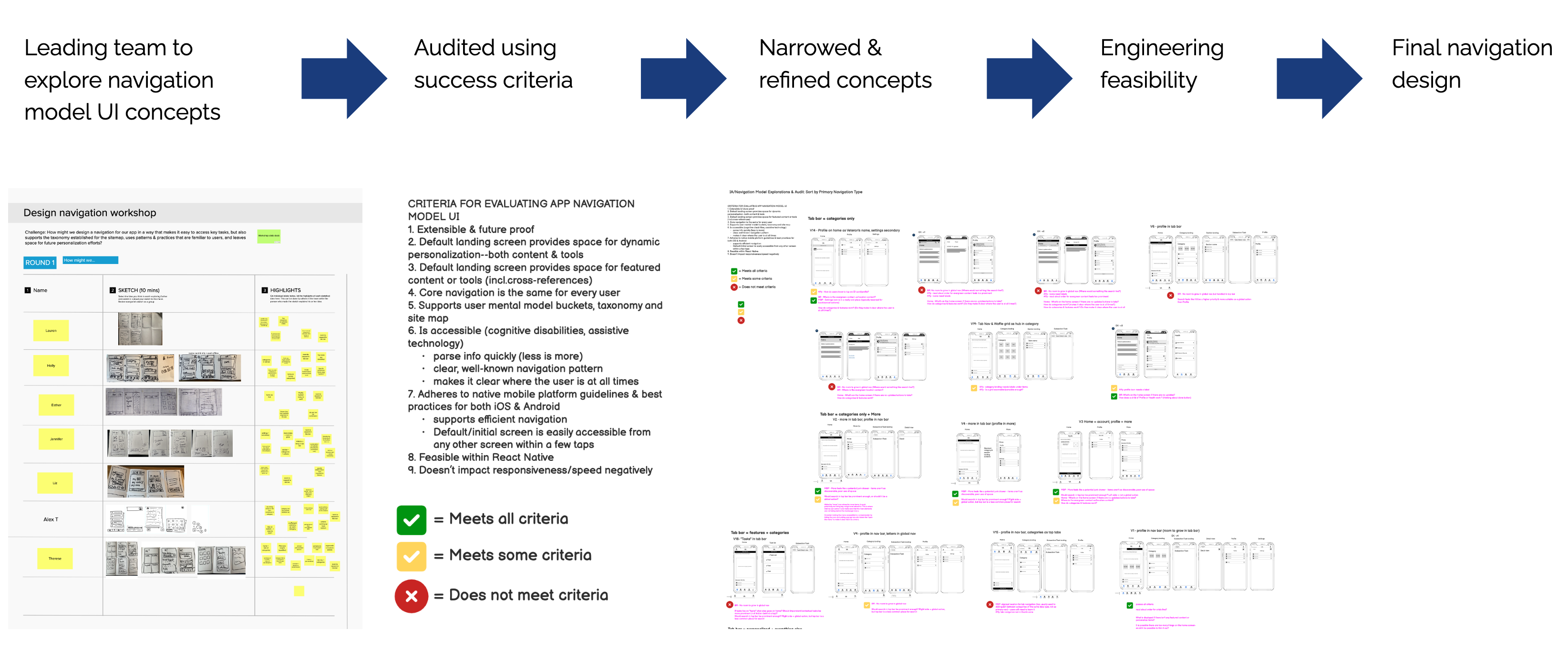
In the final tab-based navigation design, key improvements included descriptive back buttons, clearer screen titles, and space for future global features. We also standardized screen types and transitions for improved wayfinding, accessibility, and to enable future teams to build new features quickly and consistently.
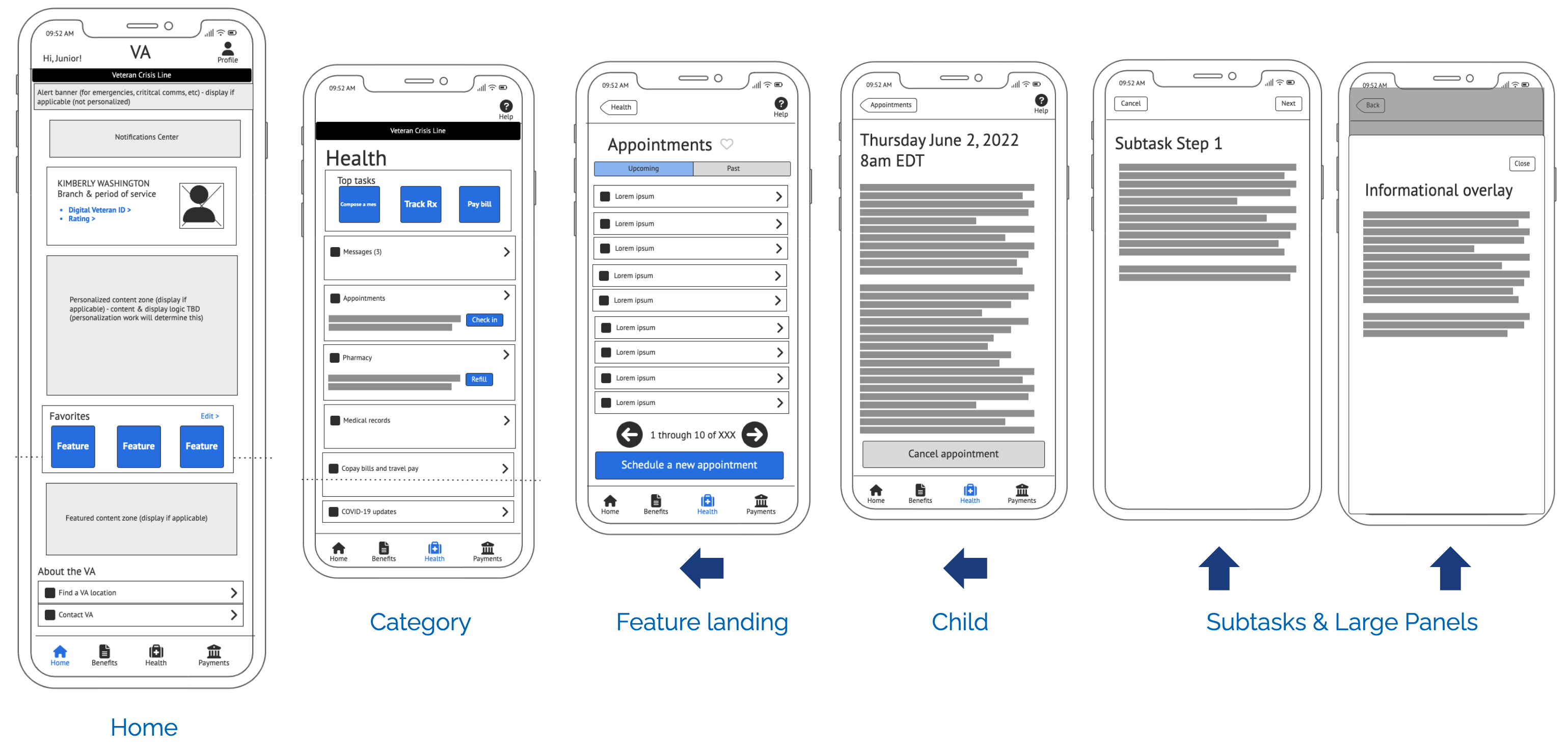
Final tab navigation and screen template design wireframes.
Last, because the VA mobile app is one of many digital touchpoints that Veterans use to manage their benefits, we collaborated closely with stakeholders at VA to ensure that the language we used worked for the app’s tight character counts and with language present in the broader VA.gov ecosystem.Evaluative research: Navigation model concept test
We tested the updated IA and navigation concept with 13 Veterans to ensure the design worked in practice. Participants were tasked with updating personal information and checking claim statuses using a low-fidelity Figma prototype displayed on their mobile device.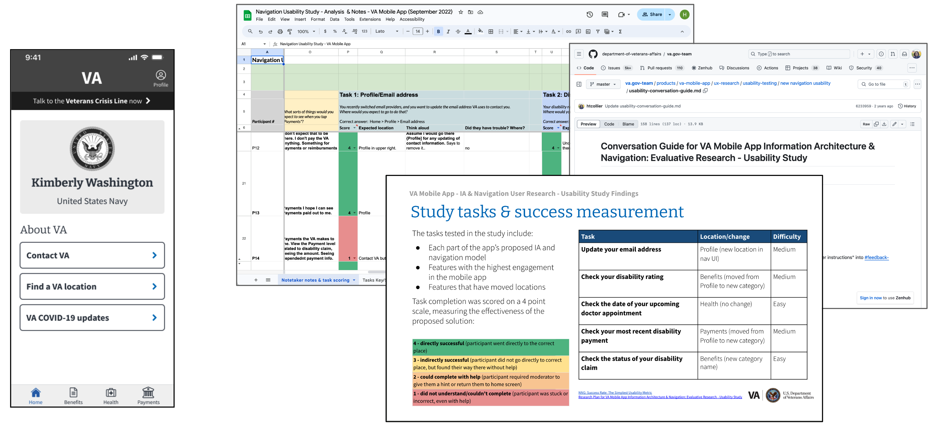
Concept test artifacts.
The results were overwhelmingly positive: 97% of participants successfully completed tasks. Veterans found the navigation model and IA to be intuitive, with clear category labels and a structure that matched their expectations—including the new Payments category. Even users unfamiliar with the app navigated the system with ease.
Implementation: High fidelity design and development
Once the IA and navigation structure proved to be successful with Veterans, we moved on to implementation. I worked with a visual designer to create high-fidelity mockups for each screen type defined in the new navigation structure. The engineering team built the mockups of the screen types as reusable templates, and I created a plan to help the engineering team to efficiently implement the template and content changes necessary for each screen across the app—without requiring mockups for every screen. We developed a spreadsheet documenting all of the current screens in the app and then describing how each screen would change (including location in the app’s navigation, title and back button content, high fidelity template used, and screen transition) This saved the team significant time.
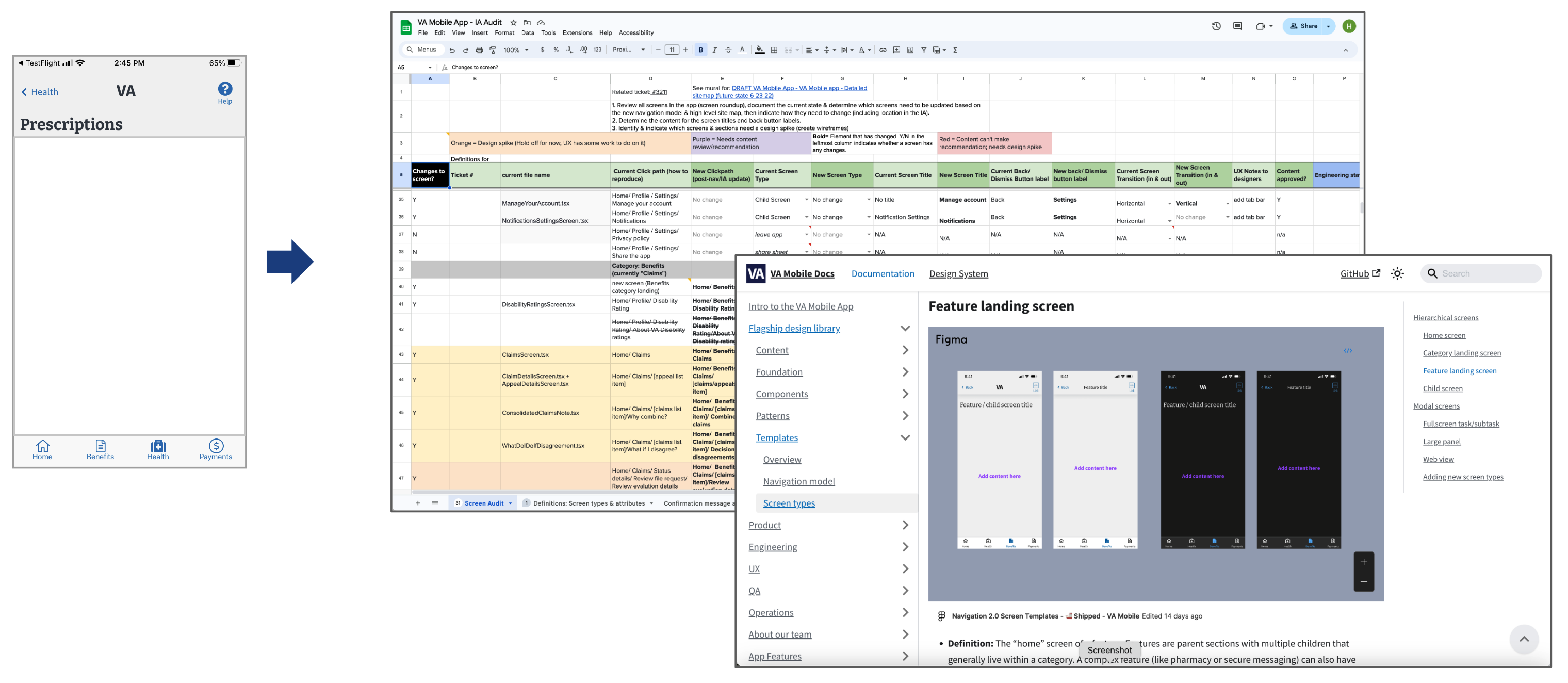
Implementation plan artifacts, high fidelity template designs.
Finally, we created documentation for the new IA, navigation model, and each screen type (including transitions) to guide future updates. We held knowledge-sharing sessions with the larger mobile team to ensure that everyone understood the design principles and could apply them consistently.
RESULT:
The launch of the redesigned information architecture (IA) and navigation led to significant improvements in usability and user satisfaction. Key outcomes included:- Improved Task Completion: Veterans experienced a 97% success rate in completing tasks during pre-launch usability testing.
- Consistent Engagement: Post-launch analytics indicated steady traffic to key features, with user interactions holding strong in the six months following the update.
- High App Ratings: The app maintained an average rating of 4.7 out of 5 stars on both the App Store and Google Play, with Veterans consistently describing the navigation as "easy" and "intuitive" in their reviews.
- Accessibility: Follow-up research focused on blind and low-vision Veterans confirmed that the new navigation design works well with assistive technology, , ensuring inclusivity for all users.
These improvements to the app’s navigation and information architecture brought the VA Health & Benefits mobile app up to speed with native mobile best practice, prepared the app for future feature additions—including space for a new personalized home screen—and enabled feature teams to add features to the app quickly and consistently.
The success of the new Payments category in the mobile app also laid the groundwork for and led to our stakeholders at VA exploring similar changes to the organization of payments and debt information for the VA.gov website.
View the full project documentation on VA github (public)
Agency:
Ad Hoc LLC
Awards:
Samuel J. Heyman Service to America Medal | Finalist – VA Health & Benefits Mobile App (Program Award) (2024)
FedScoop 50 Award | Nomination – Innovation of the Year: VA Health & Benefits Mobile App (Program Award) (2023)
VA Mobile App in the news:
Leading by Example: Creating Exceptional Digital Experiences at VA (April 2024)
2 million Downloads: VA Health and Benefits Mobile App (March 2024)
Empowering Veterans with Low Vision and Blindness (Feb 2024)
The White House | FACT SHEET: Putting the Public First: Improving Customer Experience and Service Delivery for the American People (Dec 2021)
Download the VA: Health & Benefits mobile app:
iOS App Store
Google Play Store