U.S. Department of Veterans Affairs: VA mobile app personalized home screen
Surfacing personalized, actionable content to support Veterans and boost retention
The VA Health & Benefits mobile app connects over 2 million Veterans (including those with sight and hearing impairments) to essential benefits and services from VA. The app’s personalized home screen combines content that is variable, fixed, personalized and evergreen to deliver an experience that surfaces value to Veterans and supports understanding of the app’s capabilities, regardless of how much or what a Veteran’s interactions are with VA.

PROBLEM:
Launched in 2021, the app quickly gained high praise with an average rating of 4.8/5 in the App and Play Store. However, by 2023, usage data revealed a retention issue. Some Veterans weren’t finding enough value in the app to return after their first use. While the original VA mobile app home screen displayed personal information and provided access to all parts of the app, it wasn’t tailored to individual Veterans’ needs. Veterans weren’t being proactively informed about critical actions they needed to take, and many didn’t fully understand the app's capabilities.
The main issues included:
To address these issues, the team’s goal was to personalize the home screen to deliver tailored content and improve retention by surfacing more value for each Veteran based on their individual needs and status with VA.
The main issues included:
- Lack of Proactive Notifications: Veterans weren’t being informed in a timely way about critical actions they needed to take.
- Limited Understanding: Many Veterans had inaccurate expectations about what the app could offer.
- Lack of Overview: Veterans struggled to get a quick overview of ongoing tasks or interactions with VA, such as appointments or claims.
- Limited Support for Life Transitions: The app didn’t address the unique circumstances of Veterans going through major life events like moving or getting married, leaving them unsure of what VA services they could access.
To address these issues, the team’s goal was to personalize the home screen to deliver tailored content and improve retention by surfacing more value for each Veteran based on their individual needs and status with VA.

VA mobile app, July 2023
MY ROLE:
UX Strategy, Interaction Design, User ResearchAs UX Lead, I was responsible for defining the UX strategy, interaction design, and user research. I led the effort to bring personalization to the home screen of the app, working closely with product managers, engineers, and visual designers.
My primary responsibilities included:
- Defining the UX Strategy: I collaborated with product to define a northstar for a personalization approach in the VA mobile app as well as the approach for integrating personalization into the app’s home screen, including what content to prioritize and how to present it.
- Leading User Research: I conducted both discovery research and qualitative research to better understand Veterans' needs and test our design hypothesis.
- Designing the Product Architecture: I worked with product and engineering to define the functional requirements for the MVP and created wireframes for the product’s architecture, uniting health and benefits feature data as a holistic system and fleshing out home screen’s appearance logic.
- Collaboration: I coordinated closely with cross-functional teams to ensure the new feature met both user and business goals, while adhering to the technical constraints of the app.
IMPACT:
The personalized home screen launched in July 2024 with measurable success.Key impacts included:
- Improved Retention: User retention increased by 6%, a key success metric for the project.
- Positive Feedback: Veteran users praised the new design for being easier to navigate and more informative.
- Increased Engagement: Prescription refill rates increased by 62%, and unread message read rates rose by 5%, indicating that Veterans were engaging more actively with their app content.
- Streamlined App Usage: Claims and appointment page views dropped by 4% and 2%, respectively, showing that the personalized content on the home screen was reducing unnecessary navigation and helping users quickly find what they needed.
Our client issued us a challenge: Bring “personalization” to the VA mobile app in order to address the app’s retention problem.
PROCESS:
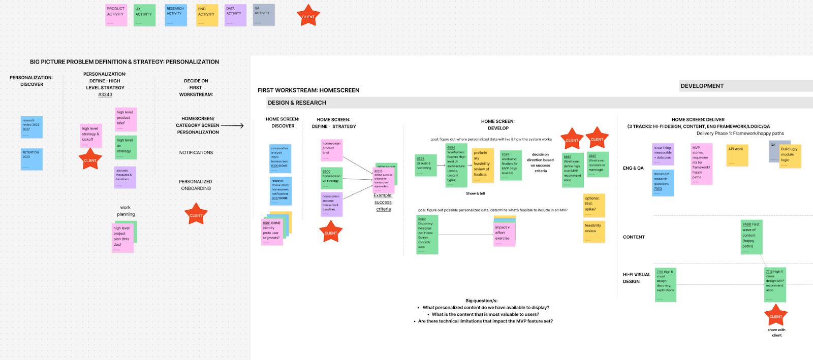
To bring personalization to the home screen in a way that balanced user needs, business goals, and technical contraints, our team followed a structured, iterative design process that involved research, strategy definition, and continuous refinement of our approach.Discovery & Strategy
To ensure our solution met the needs of Veterans, I began with a desk research phase to identify gaps in the app's current user experience and to understand unmet needs within the Veteran community. This research helped us define what "personalization" meant in the context of the VA app and how it could improve the experience for Veterans—our “north star” for personalization.We decided that our north star goals should be to:
-
Provide a persistent snapshot of status and interactions: Veterans should easily see their current status with the VA, including any critical tasks.
- Proactively notify Veterans of important actions: We wanted to surface tasks and updates without requiring Veterans to search for them.
- Tailor content to individual needs: Content should adapt to the specific circumstances and needs of each Veteran.
Artifact from comparative analysis exploring apps with similar data needs and task types.
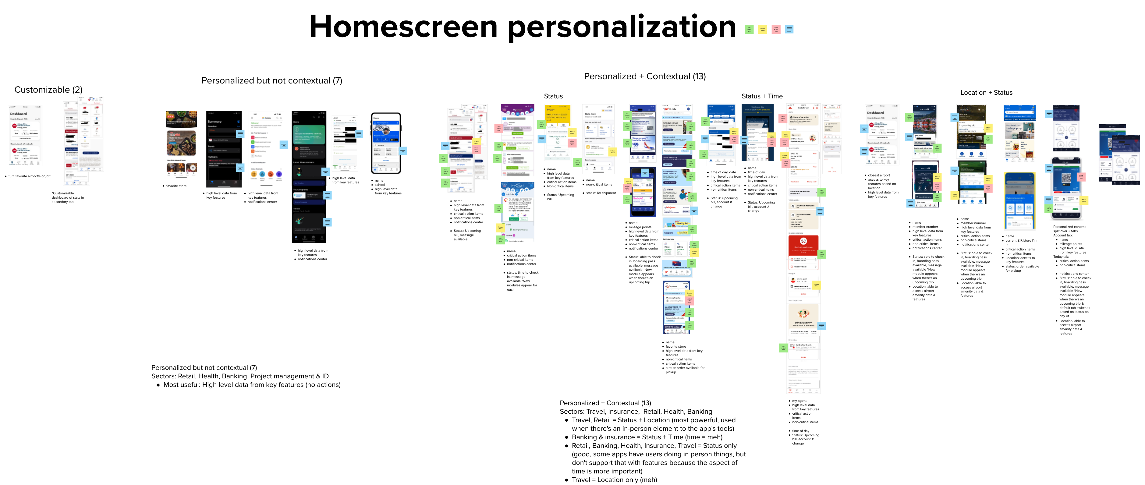
I also conducted a competitive analysis of apps with similar data needs and task types to understand personalization best practices and patterns across industries (travel, health, banking, insurance).
Defining the Hypothesis
After gathering these insights, I worked with my product partner to form a hypothesis:Personalizing the app’s home screen will help Veterans keep up with and manage their interactions across VA and find value in the app that they aren’t discovering now.
We would know we were right if we saw:
- Improved user comprehension of the app’s capabilities.
- Increased perceived value of the VA mobile app.
- Higher user retention rates.
- Feature engagement numbers that suit that feature’s desired usage behavior:
- An increase in engagement with features that display frequent changes/actions to take—like Prescriptions and Messages.
- A decrease in engagement with features that don’t change often (and whose data is enough to satisfy user need)—like Claims and Appointments.
Design & Development
Functional requirements, exploration & initial wireframesI led the design process, collaborating with engineering to create functional requirements for the personalized home. We used data from research, best practices, and cross-functional workshops to define what content to surface.
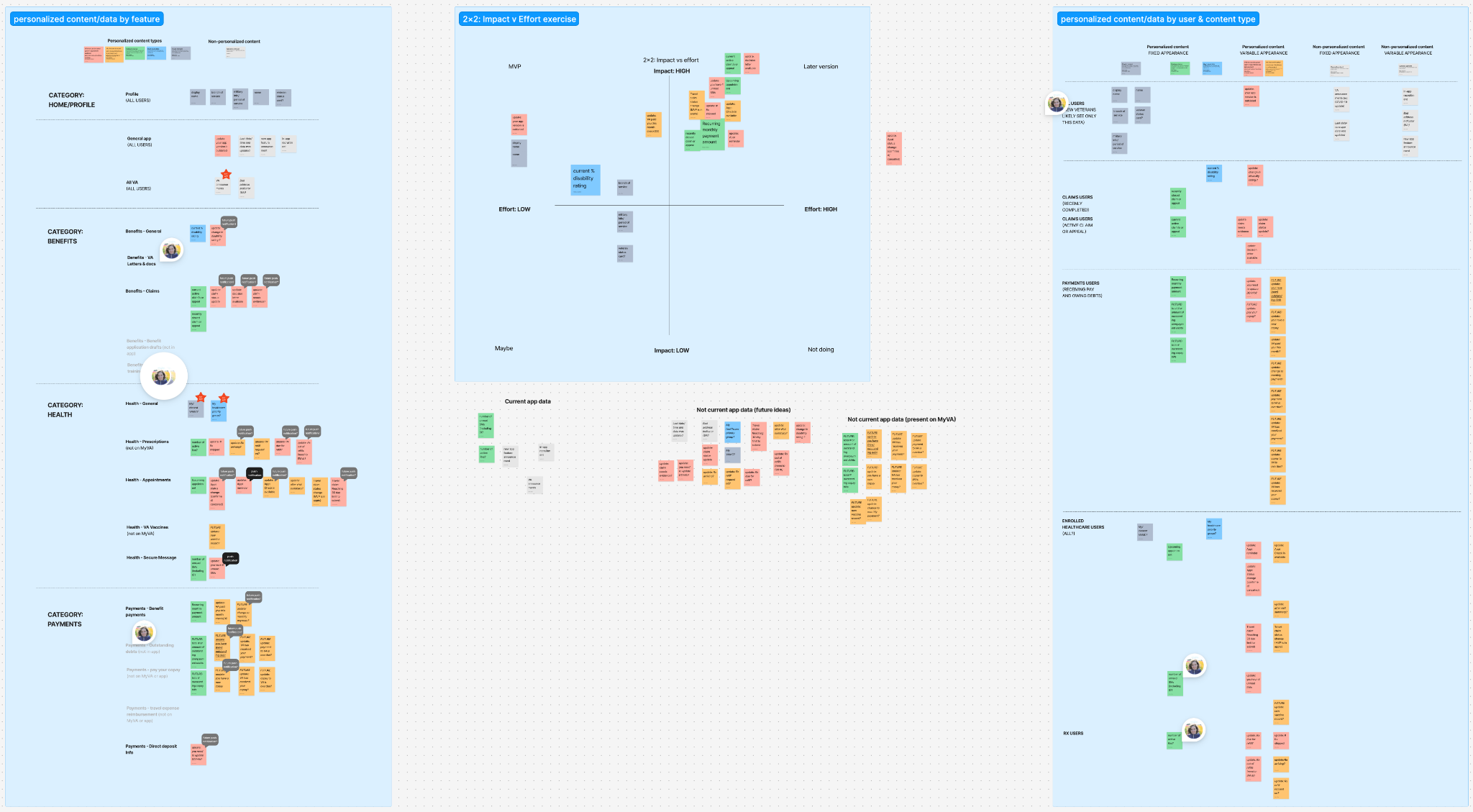
Our vision for the personalized homescreen MVP
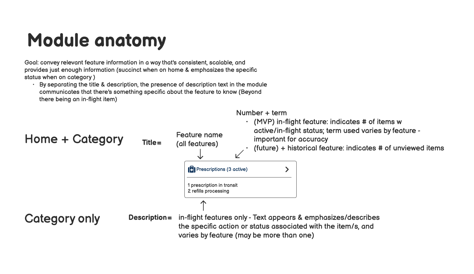
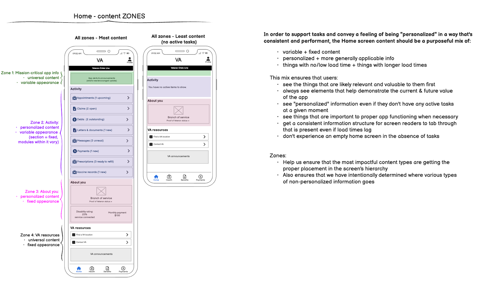

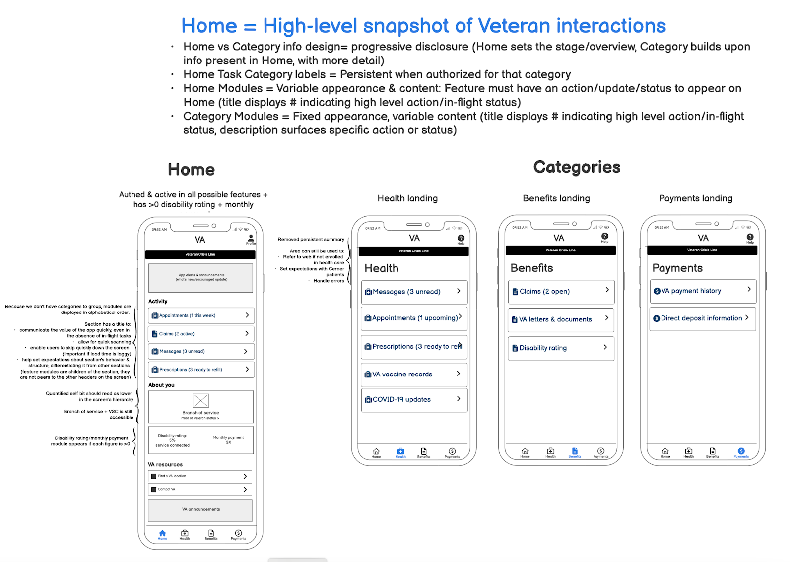
I created wireframes documenting a high-level design for the personalized home screen that would surface the most impactful available data together as a cohesive system (despite inconsistencies in attributes between data types!) while leaving room for future expansion, and ensuring that it still performed in lower internet connectivity situations as well as with screen readers. I also defined zones to govern future content additions & include a mix of data types—making sure that Veterans saw valuable, personalized content regardless of how much they had going on with VA.
Simplifying scope before the release
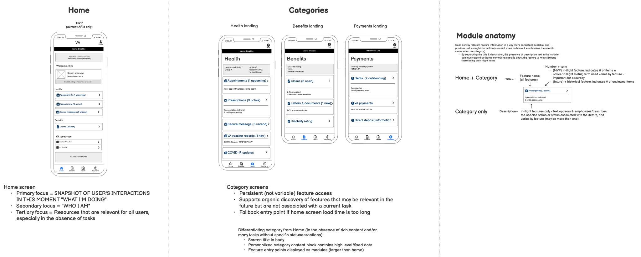
Prior to release, the client gave us a late-breaking challenge to further reduce our scope, and we revised the wireframes an additional time to further simplify the design. We streamlined the home screen’s structure (while maintaining important “mile-markers” for screen readers) and simplified the data appearing on category screens, reducing development and QA testing time.
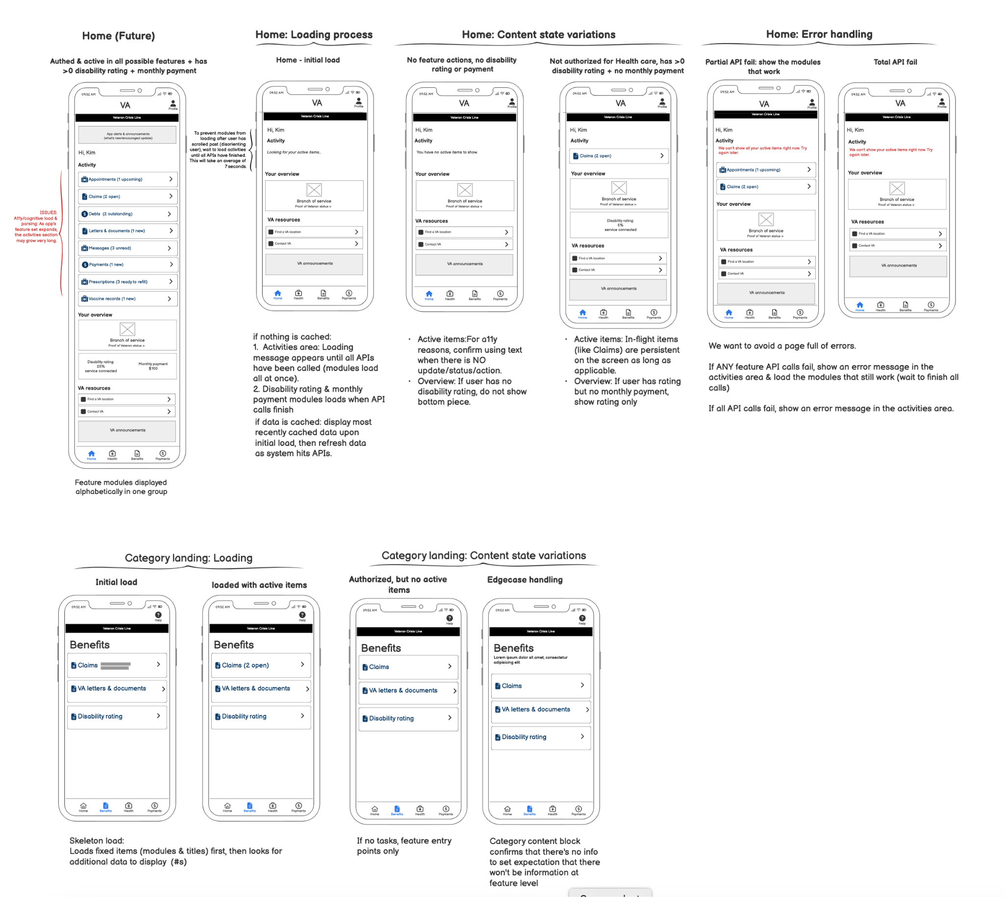
Wireframes depicting the simplified personalized home screen approach and appearance logic, including loading and error states.
Bringing the MVP to life
Next, I collaborated with a visual designer partner to finalize the look and feel of the personalized home screen. We ensured that the design adhered to the VA’s established visual design system and improved accessibility through better color contrast and clearer layout. Meanwhile, I created documentation describing the home screen purpose, content zones, and functions.
 High fidelity visual design comps depicting light & dark mode.
Evaluative research
As part of the iterative design process, I conducted evaluative research to test the effectiveness of the personalized home screen at achieving our two qualitative success measures: comprehension & perceived value. We gathered feedback from a diverse group of Veterans, including both current users and non-users of the app, as well as with users of screen readers. Participants installed a pre-release production app on their own devices and signed into using their VA credentials, allowing them to see and engage with their personalized information.

Study protocol, note-taking & synthesis artifacts
The research revealed that while users had a better understanding of the app's features and found the personalized content more useful (and usable), there was limited improvement in how Veterans perceived the overall value of the app compared to prior research. Given that the concept had passed both of our qualitative success measures, the team decided that the personalized home screen was ready for production.

RESULT:
The launch of the personalized home screen in July 2024 yielded positive results:-
App retention improved by 6%, indicating that the personalized approach successfully encouraged users to engage with the app more frequently.
-
Additional metrics showed improved task completion rates:
- Prescription refill rates rose by 62%.
- The message read rate increased by 5%.
- Claims page views decreased by 4% and appointment page views by 2%, suggesting a more efficient user experience.
Veteran feedback in App and Play Store reviews was overwhelmingly positive, with users appreciating the new layout and ease of use. Some noted the improved navigation and clarity of the information presented:
“Much easier than calling every time I need information. I really love the new layout and the GUI is super easy to use. I’m hoping they can integrate video conferencing into it soon!”
“The new release is great. All important info on the home screen.”
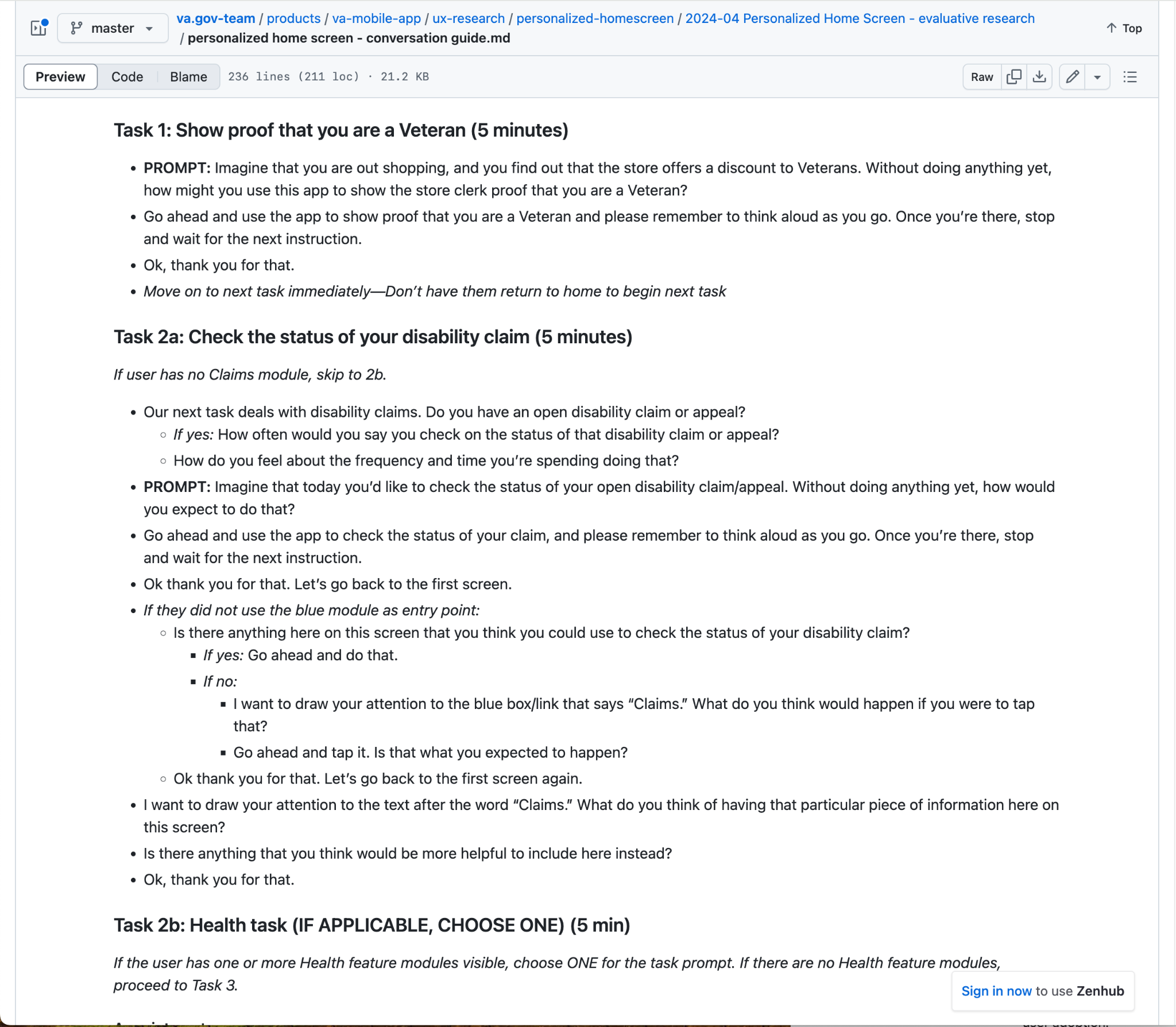
View the full project documentation on VA github (public)
Agency:
Ad Hoc LLC
Awards:
Samuel J. Heyman Service to America Medal | Finalist – VA Health & Benefits Mobile App (Program Award) (2024)
FedScoop 50 Award | Nomination – Innovation of the Year: VA Health & Benefits Mobile App (Program Award) (2023)
VA Mobile App in the news:
Leading by Example: Creating Exceptional Digital Experiences at VA (April 2024)
2 million Downloads: VA Health and Benefits Mobile App (March 2024)
Empowering Veterans with Low Vision and Blindness (Feb 2024)
The White House | FACT SHEET: Putting the Public First: Improving Customer Experience and Service Delivery for the American People (Dec 2021)
Download the VA: Health & Benefits mobile app:
iOS App Store
Google Play Store